You deliver freight.
We’re here to deliver more customers.


+


We know what you’re thinking: Who the heck is Behemoth and why should we talk to these guys? Good questions. Behemoth is a small, creative-driven advertising agency in Kansas City happens to have a truckload of experience in the freight and logistics business. During our careers, we’ve created work for YRC Freight, YRC Worldwide, Old Dominion and a 3PL called HNRY Logistics. We’ve also worked with an array of non-freight industry giants as well, such as McDonald’s, Sonic Drive In, Children’s Mercy, Smart Warehousing, Big O Tires and Hostess.
Together, with our partners, we’re able to provide full creative and design services, digital and social media campaigns, media buying, media planning and freight industry-focused insights, strategic planning and growth plans.
(Get ready. Here comes a trucking pun.)
Give us a shout and let us help drive your business forward. But before you do that, scroll down and take a look at some work we’ve done. You’ll also find more on the main Behemoth website. Thanks for your time.


WHAT WE ARE:
A small, creative-driven advertising-ish agency with an ironic name. We provide big agency experience with a more nimble, efficient approach to brand building.
WHAT WE CAN HELP YOU WITH:
Sales materials, video, digital creative and content, trade show materials, internal campaigns and communication, recruitment campaigns, direct mail, social media campaigns, web design, print advertising and freight industry-focused insights, strategic planning and growth plans.
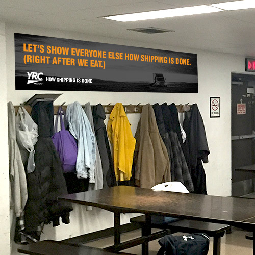
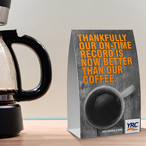
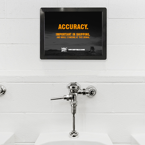
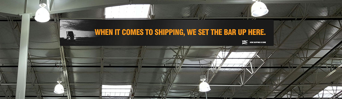
A few years ago, we were asked to help rebrand YRC Freight and give it a new look and voice. We started off by creating a new tagline. Since YRC Freight basically invented the entire concept of LTL shipping back in the 40’s, we wanted it to reflect their history and experience in the logistics category. The tagline “How shipping is done” became a filter by which all work was subject to, both internally to employees and externally to clients.
FROM THE INSIDE OUT
The campaign we developed for YRC Freight had internal and external components that introduced a totally new look and feel. Internally, we plastered the terminals and corporate offices with morale-boosting banners, stickers and posters. We created videos. And we designed notebooks, t-shirts and other customer swag. It was tough, gritty and focused on their greatest asset—the bad ass people doing the work.


EXTERNAL COMMUNICATION
We launched our bold new look and more confident brand voice externally with a video introduction. We also updated every piece of printed material YRC Freight uses from print advertising to trade show booths to the entire library of sales materials. And because they have 15,000 free rolling billboards, we also wrapped some trucks.
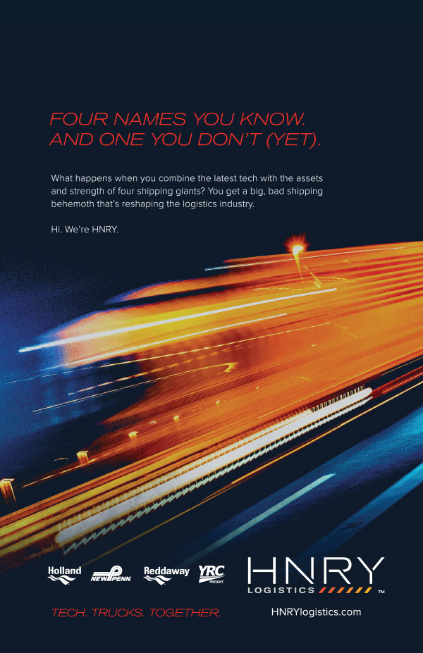
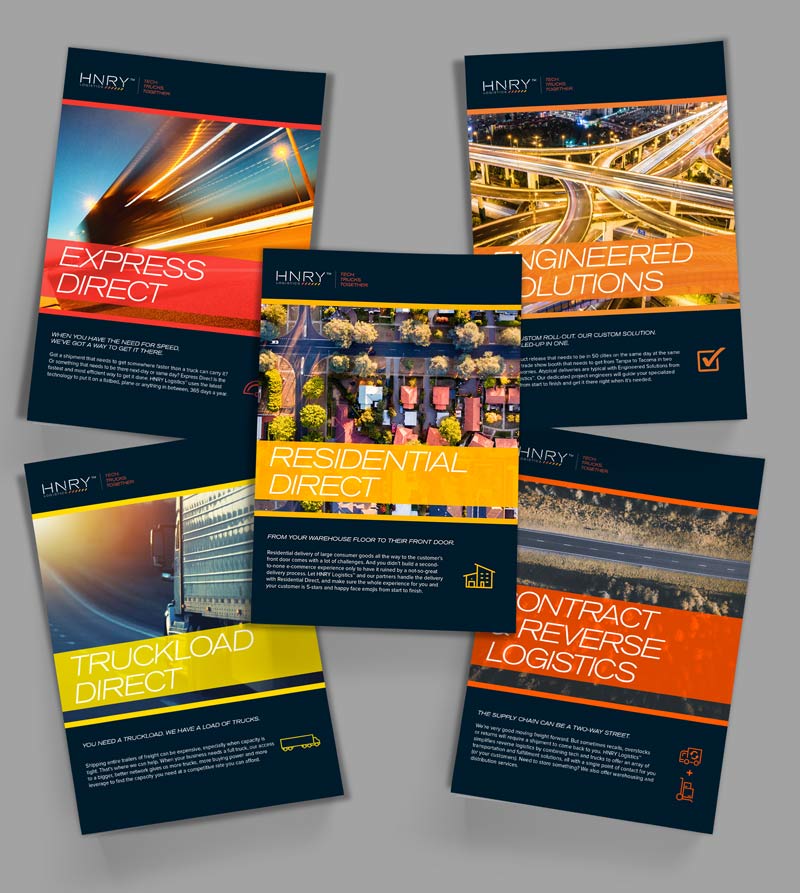
HNRY LOGISTICS
In 2018, YRCW started a new freight brokerage they called HNRY Logistics. Everyone in the shipping world was already familiar with YRCW and the LTL capabilities of their four operating companies, but HNRY Logistics was a new, more progressive arm of the company that needed to have its own look. We created a visual identity and voice that positioned it as a more modern freight solution (with a few subtle nods to their past).

SERVICE VIDEOS
The HNRY launch included a series of introductory videos, explaining who the company is and what they do. It also gave us the opportunity to create some wacky icons, because who doesn’t love an icon?
Collateral
We also designed an entire system of collateral for the sales team.

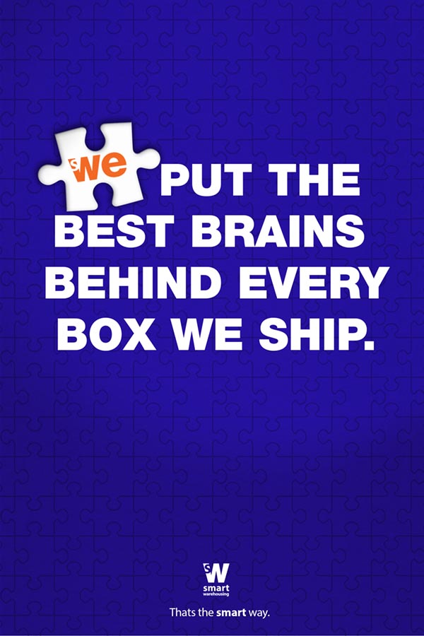
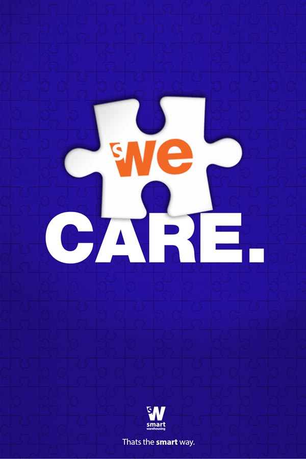
SMART WAREHOUSING
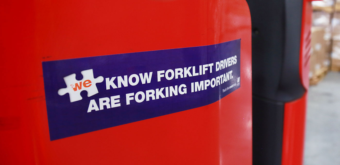
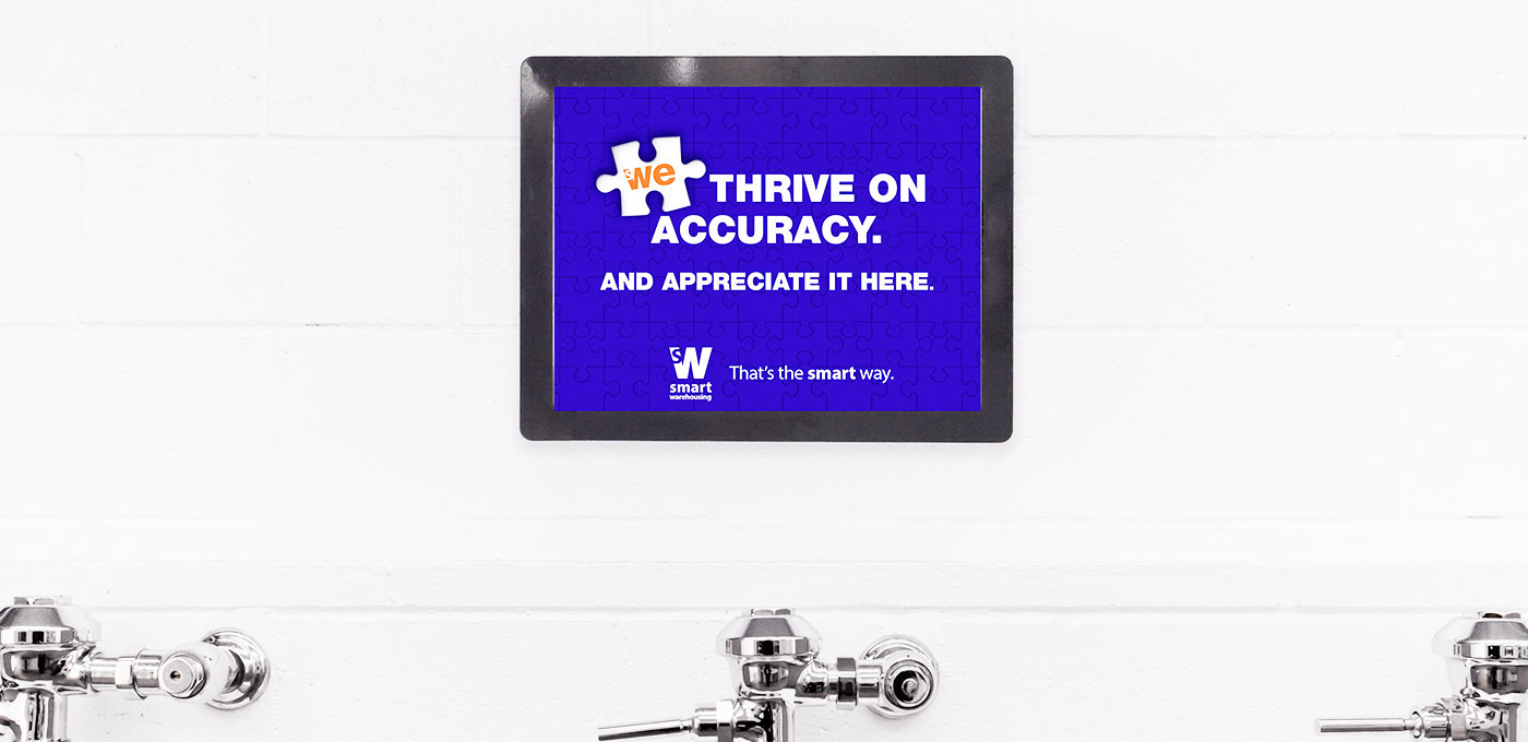
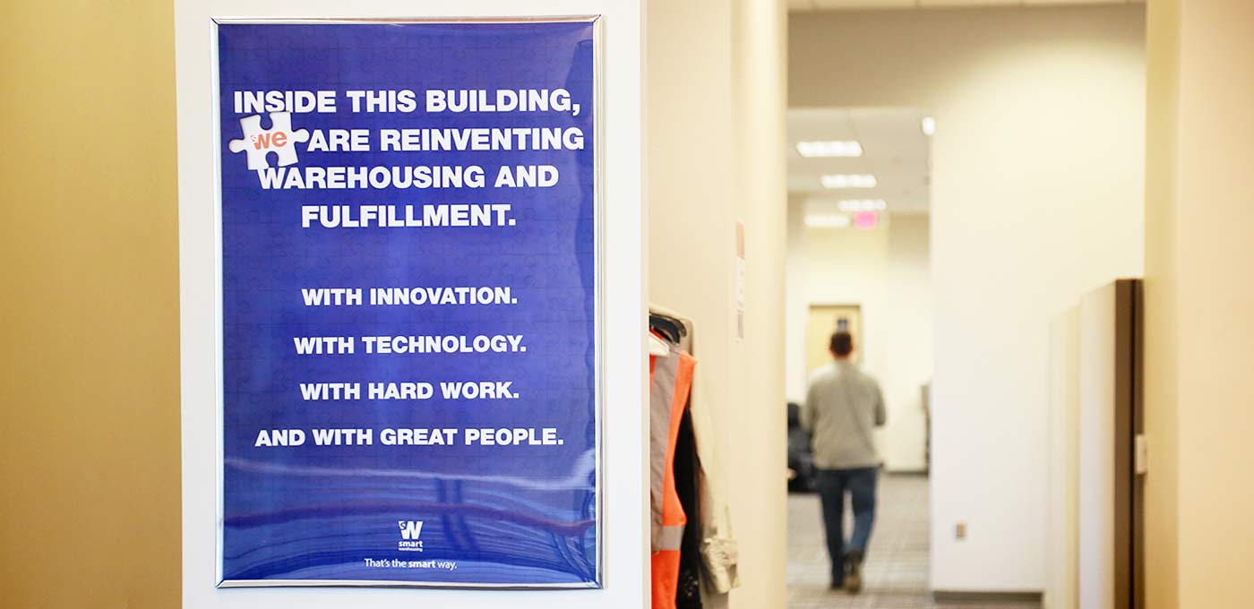
Smart Warehousing came to us with an interesting problem. They didn’t need advertising or branding–they already had more business than they could handle. But employee turnover was unusually high. It turns out that they had grown so quickly, the personality of the company and its founder had been lost along the way. The first thing we did was interview employees from top to bottom to get their thoughts on the company and what it meant to them. We then created an internal branding campaign based around a simple line: That’s the Smart way. It was a little more than a tagline. It became a mantra and rallying cry. An ownable phrase that immediately told employees and customers that our way was different. And since Smart Warehousing operates as a mostly invisible (but crucial) link between companies and customers, we used a puzzle piece as our visual.


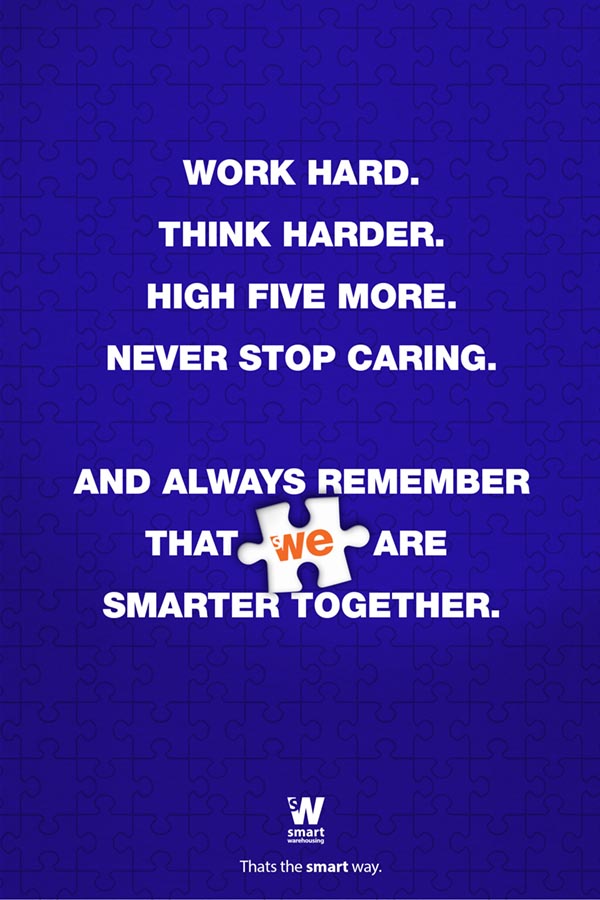

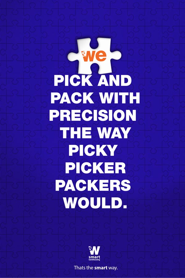

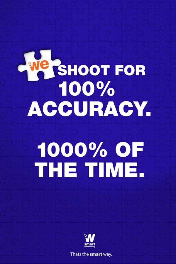

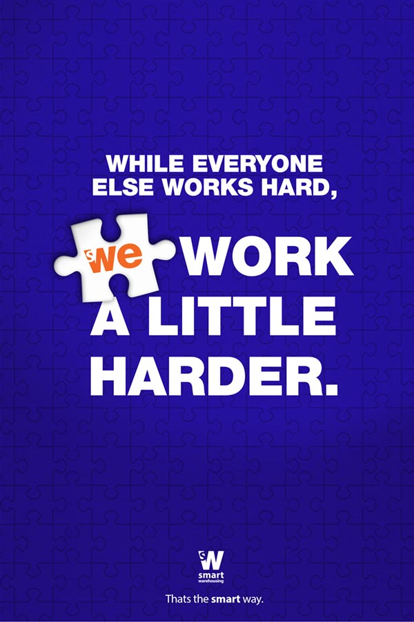
We covered the corporate office and all 25 warehouses with posters, signs, floor graphics and banners carrying our new messaging. We utilized bathroom walls, break rooms and forklift bumpers. We also designed a “new employee” kit to welcome new members to the team. People smiled. Others high-fived. Morale went up. Turnover went down.

THANK YOU FOR YOUR TIME.
WE HOPE TO TALK TO YOU SOON.